Studio HappyBlood
The outpourings of Richard Hart

The Challenge
In a sea of sameness, could we imagine an elegant yet distinctive identity for a real estate development that aspired to be a positive harbinger of things to come in Harlem?
The Approach
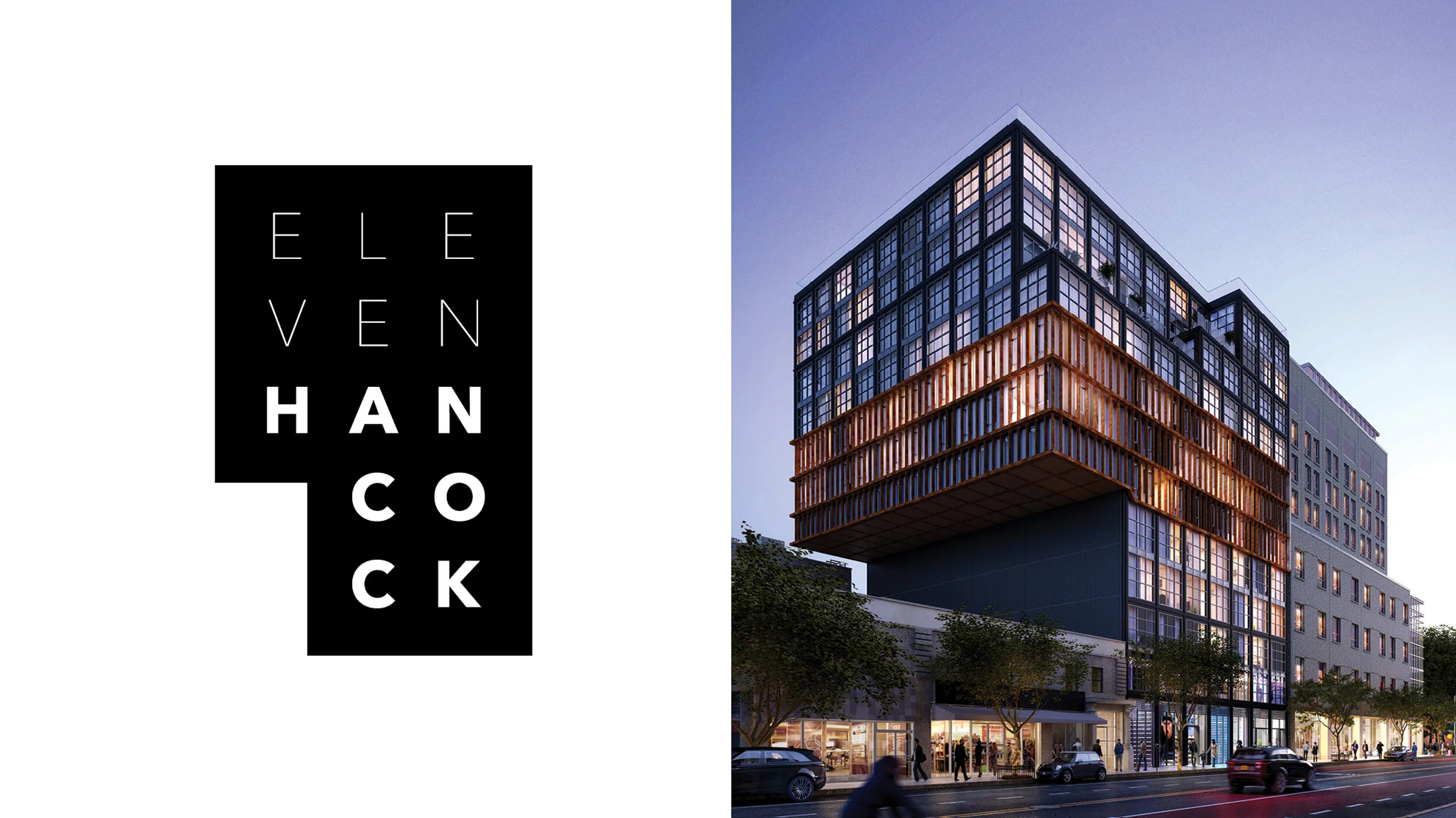
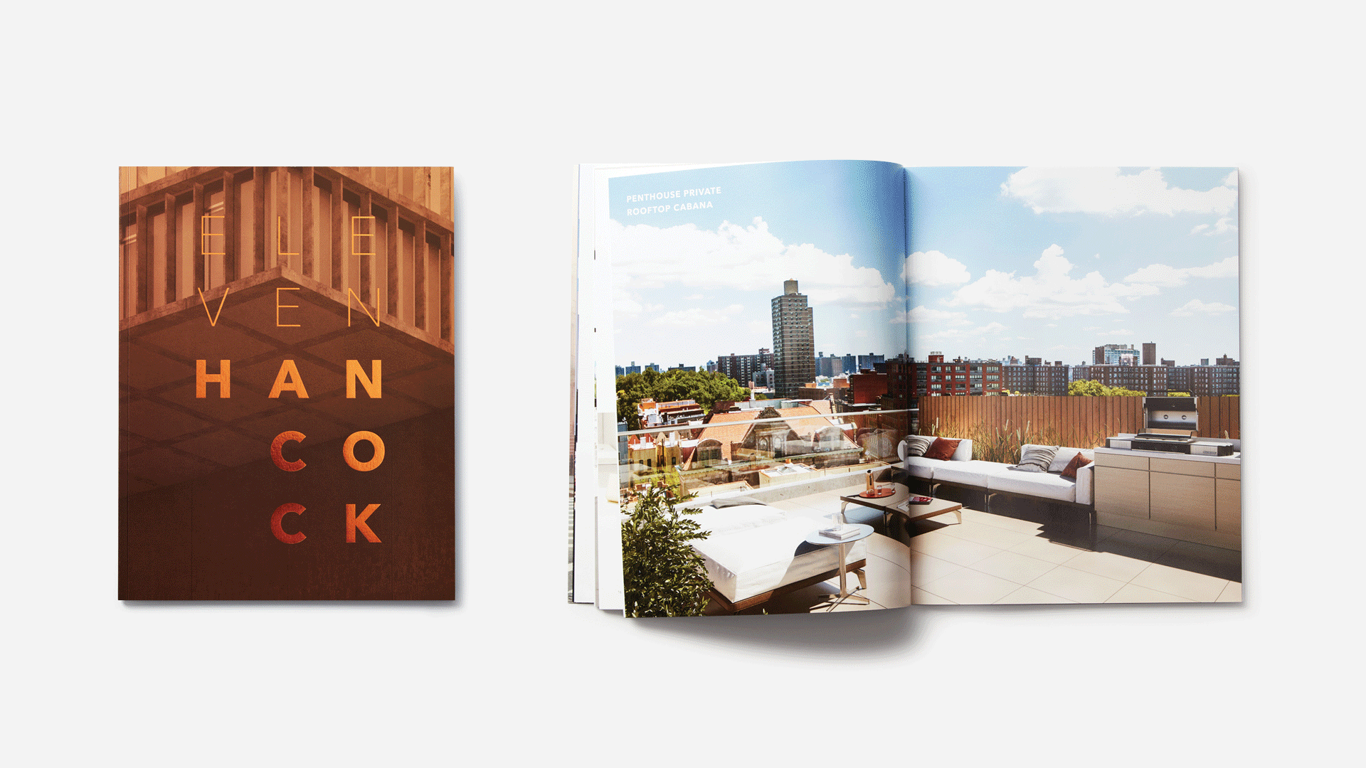
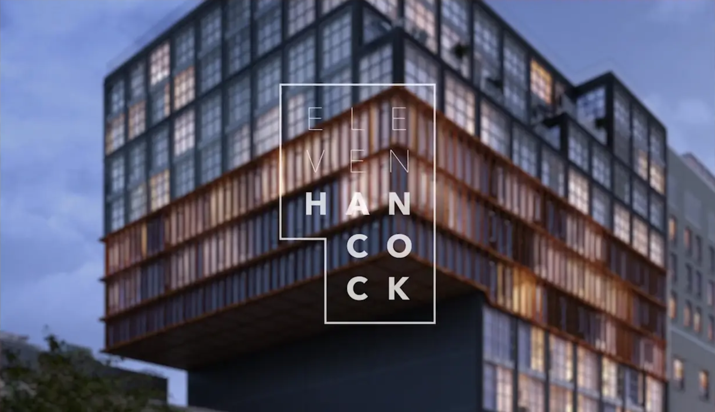
We allowed the building’s unique architecture – a cantilevered, inverted L shape – to inspire our design approach. The logo became a graphic embodiment of the iconic building’s silhouette, while touches of bronze foil and metallic ink across printed collateral, spoke to its materiality. The result was a restrained design program with moments of opulence, much like the building itself.
The Outcome
The best possible result for a branding program for a new development is strong sales. Though Eleven Hancock has only been actively on the market for a few short months, current indications are that the building will sell out within the year.